
Understanding the data offered in this web page
Information updated: 11-05-2020
What makes this map browser different
From the very beginning of the COVID-19 disease, several map browsers have appeared to illustrate the spread of the disease all around the world. COVID-19 is a complex phenomenon in space and time. Only by approaching it through several facets, from biology to geographical aspects, we will advance in a consistent way. This humble web page has the following features to contribute to the inspiration of researchers and people wishing to complete a little bit the synoptic view that humankind needs:
- We have selected a set of indicators to provide and synthetic view of the phenomenon in space and time. This includes totals, accelerations, last days trend, etc, for different groups (Confirmed, Deaths and Recovered).
- Data can be browsed by date using the drop-down menu on the left, so the dynamics can be seen at any moment of the history of the disease.
- When querying on a map symbol, a new box shows several charts with the time series for that country, and the numerical data of the chart can be copied to the clipboard for further analysis.
- Charts have colors depending on the concept they illustrate:
- Active (=Confirmed-Death-Recovered) in brown.
- Confirmed in red.
- Deaths in grey.
- Recovered in green.
- Reproduction rate in blue.
- Some data are averaged every 5 days (noted “av. 5”) (date on the graph is the central day of the moving average).
- Charts have colors depending on the concept they illustrate:
- Possibility to see the detailed data from Spanish and Catalan ambits (you will understand our natural interest for our geography and the nearest colleagues and families)
Small instructions and directions
- Visual information depends on the variable selected in the menu on the left, but when querying a country or area, the new box that appears shows the information for all variables and available dates. To query a country or area first select the "Query by location button":

- As said, there is a drop-down menu at the beginning of the legend to select the date with the data to be shown on the map; after that, you may change the date simply with the keyboard arrows up and down (not necessary to drop-down and select again) creating the effect of an animation in the map. Nevertheless, charts shown after a click on the map correspond to the entire series.
- The click on the map has to be done inside the symbol (not all the country area is active).
Data sources
Please click at the name of the institutions at the top of the page, or below.
How derived data is calculated
We assume that the following variables are available every day:
- Confirmed accumulated cases
- Accumulated deaths
- Accumulated recovered cases
Active and recovered cases
With these 3 variables we automatically generate the active cases (reported) by subtracting the dead and the recovered cases form the confirmed cases. This worked in the early days of the pandemic but soon many countries discontinued reporting recovered cases (e.g. UK) or are clearly underreporting them (e.g. USA). We opted for a very simplified model to estimate active cases: Based on the information about the desease behaviour, we know that in most of the cases, confirmed cases are fully in 15 days. This way we can assume that, for most people, the confirmed cases 15 days ago are not active today anymore. Accepting this assumption, active cases can be estimated by the accumulated confirmed cases today minus the accumulated confirmed cases 15 days ago. We have compared this estimation with countries that are still providing reliable information on recovered cases (e.g. Austria), and the results are similar (sometimes after a pick, this model underestimates a bit the result). This data is maked as "active estimated" (to make a clear diference with the "active reported"). This simple model has de advantage of only needing accumulated confirmed cases, so it can be applied to regions that only provides this parameter (e.g. Catalonia). When there is inforamtion about deaths, estimated recovery is optained by substracting the death and the estimated active cases from the accumulated confirmed cases.
Effective reproduction rate
Rt represents the effective reproduction rate of the virus calculated for each location. It lets us estimate how many secondary infections are likely to occur from a single infection in a specific area. Values over 1.0 means we should expect more cases in that area, values under 1.0 mean we should expect fewer. Values over 2.5 means that no measures have been adopted or the measures are not working. There are several models to calculate and none of them is perfect. We wanted to have a simple very simple estimation. Based on the information about the desease behaviour (e.g. https://f1000research.com/articles/9-868), we know that the incubation period for the disease is 5 days and the "natural" reproduction rate is 2.5. Since current policy in most countries forces confirmed cases to stay at home, we can consider that active confirmed cases only transmit the disease during the previous five days of the detection (declaration of active case). The result of this transmission will translate into the active confirmed cases five days into the future. In other words, if we divide the active cases today by the ones we had 5 days ago, we will have a reasonable estimation of the reproduction rate. At the beginning of the pandemic this assumption does not work, as many cases where undetected but, after two months into the first upbreak, the assumption works well, and the results are comparable with the result of much more sophisticated models.
Derived variables indicating the speed and acceleration of the desease
During the 6 months after the begining of the pandemic, we have been deriving 3 indices from each of the 4 variables (confirmed, deaths, recovered and active). To explain these indices, let's adopt the following conventions:
- t2 is the value of the time considered
- t1 is the value of the day before
- t0 is the value of the day before the day before
The derived indices use the following expressions:
- Number new cases in a day: t2-t1
- Number of new cases versus the accumulated cases: (t2-t1)/t1 (in %)
- Last day acceleration (increment of new cases versus the day before). (t2-t1)-(t1-t0) or t2-2*t1+t0
Differences are very sensible to noise caused by unwanted factors (e.g. weekend anomalies, spurious difficulties in getting the data on time for accounting it in the present day report). To filter out the noise, the values used in t2, t1 and t0 are averages of five days (from two days before to two days after). This is not possible for today and yesterday (obviously, the date for tomorrow and the day after have not been released, as they are in the future) and no average value is used in this case. Please note that values of the accumulate cases presented are not averaged: only the derived indicators are affected by averages.
If you are curious about how this is done in practice, if you call the values used in the averages of the time t4 considered (t2, t3, t4, t5 and t6), the values used in the day before (t1, t2, t3, t4 and t5) and the averages of the day before the day before (t0, t1, t2, t3 and t4), the calculations can be simplified into the following expressions:
- Number new cases in a day: (t6-t1)/5
- Number of new cases versus the accumulated cases: (t6-t1)/(t5+t4+t3+t2+t1))
- Last day acceleration (increment of new cases versus the day before). (t6-t5+t0-t1)/5
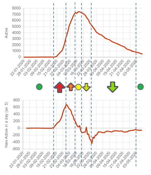
Trend indications
Rt represents the effective reproduction rate of the virus calculated for each locale. It
In addition to that, we are also providing an indication of the trend of the last days. This is done by classifying the dynamics of the pandemic in phases:
 The disease has not started. There are almost no active cases.
 The active cases are increasing and accelerating
 The active cases are increasing and decelerating
 Active cases are stable at high values (local maximum or values not increasing)
 The active cases are decreasing and the decrease is accelerating
 The active cases are decreasing and the decrease is decelerating
- Active cases are low and the disease is fading away
You can see this graphically here:
If you are curious on how exactly this is done, we consider the current value (tc), the value 5 days ago (tm) and the value 10 days ago (tf) and we apply the following logic:
Is tc > (tf+tolerance)?; tolerance=(tc+tf)/2*0.06
- yes: Is tm<(tc+tf)/2-tolerance?; tolerance=(tc-tf)*0.05
- yes:
- no:
- yes:
- no: Is tc < (tf-tolerance)?; tolerance=(tc+tf)/2*0.06
- yes: Is tm<(tc+tf)/2+tolerance?; tolerance=(tc-tf)*0.05
- yes:
- no:
- yes:
- no: Is tm low enough?; (tm<700)
- yes:
- no:
- yes:
- yes: Is tm<(tc+tf)/2+tolerance?; tolerance=(tc-tf)*0.05
About the code behind the map browser
This map browser has been created with the MiraMon Map Browser of the MiraMon Remote Sensing and GIS software now celebrating its 25th anniversary. MiraMon is a project of the Grumets Research Group. Small python scripts to transform open data into the data used in the map browser can be found here.
About the data behind the map browser
Data behind the map browser is also available in githubJoan Masó and Xavier Pons